A booking page has one job: help the client book the right appointment without needing to ask you a question.
That sounds obvious, but many barbershop booking pages make clients work too hard. They hide prices, use confusing service names, bury cancellation rules, or push people into a generic app experience that does not feel like the shop.
The result is not always obvious in analytics. A visitor may land, pause, hesitate, and leave without scrolling. That does not always mean the website is weak. Sometimes the first decision on the booking route is unclear.
This checklist is designed for barbershops that want more confirmed appointments from the traffic they already get. If you are improving your Google route, read Google Business Profile booking links for barbers alongside this.
Quick answer: what should a barbershop booking page include?
A good barbershop booking page should show:
- shop name and location
- services
- prices
- service durations
- staff or barber choices
- available times
- deposit rules if used
- cancellation policy
- confirmation details
- contact route for genuine issues
It should be easy to use on a phone and clear enough that a new client can book without messaging the shop first.
Booking page above-the-fold checklist
Before the client scrolls or commits, they should understand:
| Client question | Page element that answers it |
|---|---|
| Am I in the right place? | Shop name, area, branding, and address |
| What can I book? | Clear service list |
| How much is it? | Visible prices before confirmation |
| When can I come in? | Real availability or next available slots |
| Who will cut my hair? | Barber choice or next available option |
| What happens next? | Clear booking button and confirmation flow |
This matters because most booking traffic is impatient. If the first decision is unclear, clients may leave before they ever reach the rest of the page.
1. Make the shop identity obvious
The client should know exactly who they are booking with.
Include:
- shop name
- area or location
- logo or brand styling
- address or map link
- contact details
This matters more if the client came from Google, Instagram, or an advert. They may not have deep context yet. The booking page needs to reassure them that they are in the right place.
If the page looks generic or disconnected from the shop, some clients will hesitate.
2. Keep service names simple
Service names should match how clients think.
Good examples:
- Haircut
- Skin fade
- Beard trim
- Haircut and beard
- Kids haircut
Less helpful examples:
- Standard service
- Premium service
- Barber experience
- Tier 2 appointment
Creative names can work once a brand is established, but booking pages are not the place to make clients decode the menu.
3. Show prices before the client commits
Clients should not have to guess.
Showing prices helps because:
- it reduces anxiety
- it prevents wrong-service bookings
- it filters poor-fit clients
- it makes the shop look more professional
- it saves DMs asking "how much?"
If prices vary by barber, service, or appointment type, show that clearly. If deposits are required, explain whether the deposit comes off the final price.
4. Use realistic durations
Online booking only works if durations match reality.
If a skin fade usually takes 45 minutes, do not list it as 30 because the diary looks better. That creates pressure inside the shop and a worse experience for the next client.
Realistic durations help with:
- punctuality
- staff confidence
- client expectations
- fewer rushed appointments
- fewer awkward gaps
If you are unsure, start slightly generous and tighten later.
5. Let clients choose the right barber
Some clients care who cuts their hair. Others just want the next available slot.
A strong booking page supports both:
- choose a specific barber
- choose any available barber
- see availability clearly
- understand if prices or durations differ by barber
If every barber has a separate link, the client has to do more work. A better route keeps the shop together while still giving choice.
6. Put deposit and cancellation rules in the flow
If you take deposits or charge cancellation fees, the terms should be visible before booking.
Do not rely on an Instagram highlight or a poster in the shop. The booking page should explain the policy at the point of commitment.
Keep it plain:
- how much is due
- whether it is refundable
- how much notice is required
- what happens if the client is late
- how to contact the shop if something genuine happens
For wording, read our barbershop cancellation policy template.
7. Confirm the appointment clearly
The client should finish with certainty.
Good confirmation includes:
- date
- time
- service
- barber
- shop address
- deposit/payment status
- cancellation link or instructions
- reminder expectation
If clients are not sure whether the booking worked, they will message you anyway. That defeats the point of online booking.
8. Make mobile the main experience
Most people will not book from a desktop.
The booking page should be easy to use with one thumb:
- readable text
- clear buttons
- no tiny form fields
- fast loading
- short service list
- obvious next step
If the booking route is technically complete but awkward on mobile, it will still lose bookings.
9. Use the same booking page everywhere
The strongest setup is one route repeated everywhere:
- website
- Google Business Profile
- QR codes
- reminder emails
- client messages
- ads
When clients see the same route repeatedly, it becomes familiar. Familiar booking routes convert better because people do not need to re-learn the process.
Where Trimlinea fits
Trimlinea is designed around a branded booking page for barbershops, not a generic admin form.
You can set services, prices, durations, staff, chairs, payments, deposits, reminders, and payouts in one place. The same booking link can be used across Google, Instagram, your website, and direct messages.
The pricing stays fixed at £15/month after the free trial, with unlimited shops and chairs included.
If your current booking route feels scattered, find out more about Trimlinea and build one clean path clients can use everywhere.
Final word
A strong booking page does not need to be complicated.
It needs to be clear, fast, trustworthy, and complete. If a client can understand the service, price, time, barber, and policy without messaging you, the page is doing its job.
Sources and last checked
Last checked: 6 July 2026.
- Google Business Profile business links policies
- Google Business Profile local business links
- GOV.UK unfair consumer contracts
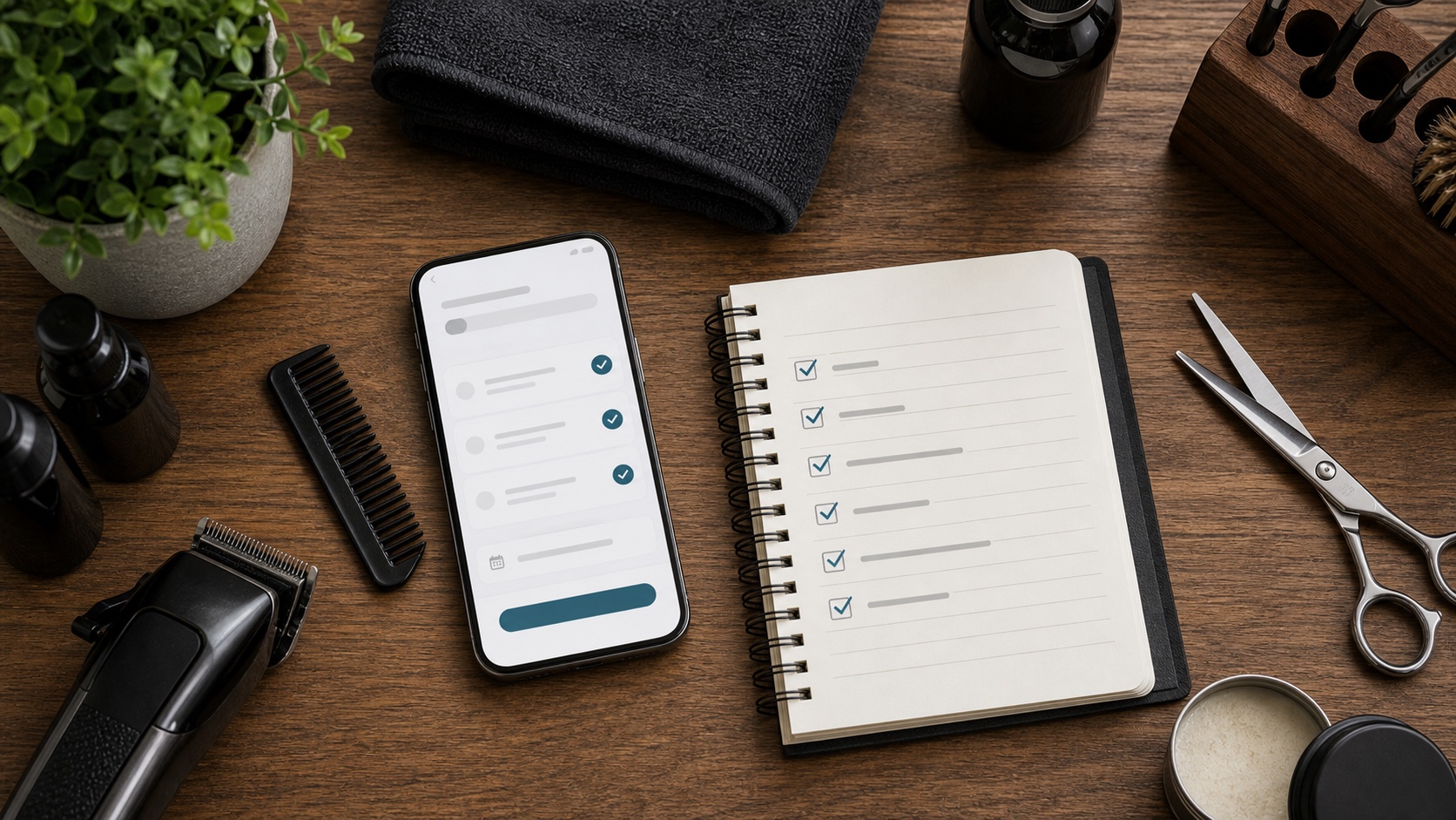
- Image: custom photographic hero showing a mobile barbershop booking checklist.
Frequently asked questions.
What should a barbershop booking page include?
It should include the shop name, location, services, prices, durations, barber or chair availability, deposit rules, cancellation terms, and a simple way to confirm the appointment.
Should a barbershop booking page show prices?
Yes. Clear prices reduce hesitation and help clients choose the right service before booking.
Is a booking page better than asking clients to DM?
For most shops, yes. A booking page lets clients choose a real slot immediately, while DMs create delay and extra admin.
Why do clients leave a barbershop booking page?
They usually leave when the service names are unclear, prices are hidden, availability is hard to understand, or the page does not feel connected to the shop.
Should a booking page work for Google and Instagram traffic?
Yes. The same mobile-friendly booking page should work as the destination for Google Business Profile, Instagram, ads, QR codes, and direct client messages.
More articles
Trimlinea gives your barbershop branded booking, staff calendars, payments, reminder emails, and payouts in one flat subscription.
Add every chair, every team member, and every shop without your software bill changing.
Find out more